Loupe V(D)J Browser v4.0 and later allows you to load .vloupe files from the cellranger aggr pipeline for multi-sample comparisons.
For a demo of the different comparisons available, download the two-sample PBMC .vloupe file.
When you open the aggregated file in Loupe V(D)J Browser, the views appear identical to those generated for a single sample file. However, each view now contains data from multiple samples.
The Filters pop-up window includes a 'Sample' filter.
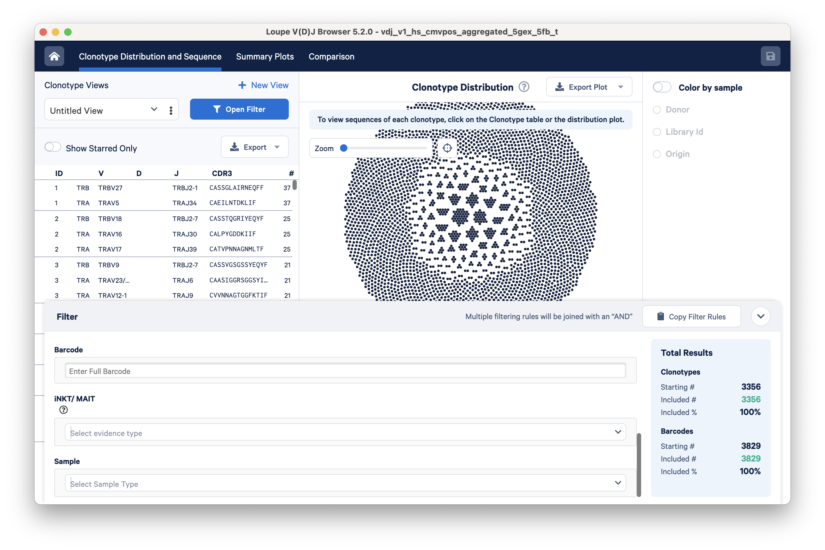
Clicking on the Select Sample Type drop-down brings up a list of options for dividing the barcodes in the file into samples. These sample options are derived from the aggregation CSV, which serves as an input file for the cellranger aggr pipeline. The default options include Donor, Origin, and Library ID, but you can also provide custom fields like 'Time Points' or 'Disease Status'.
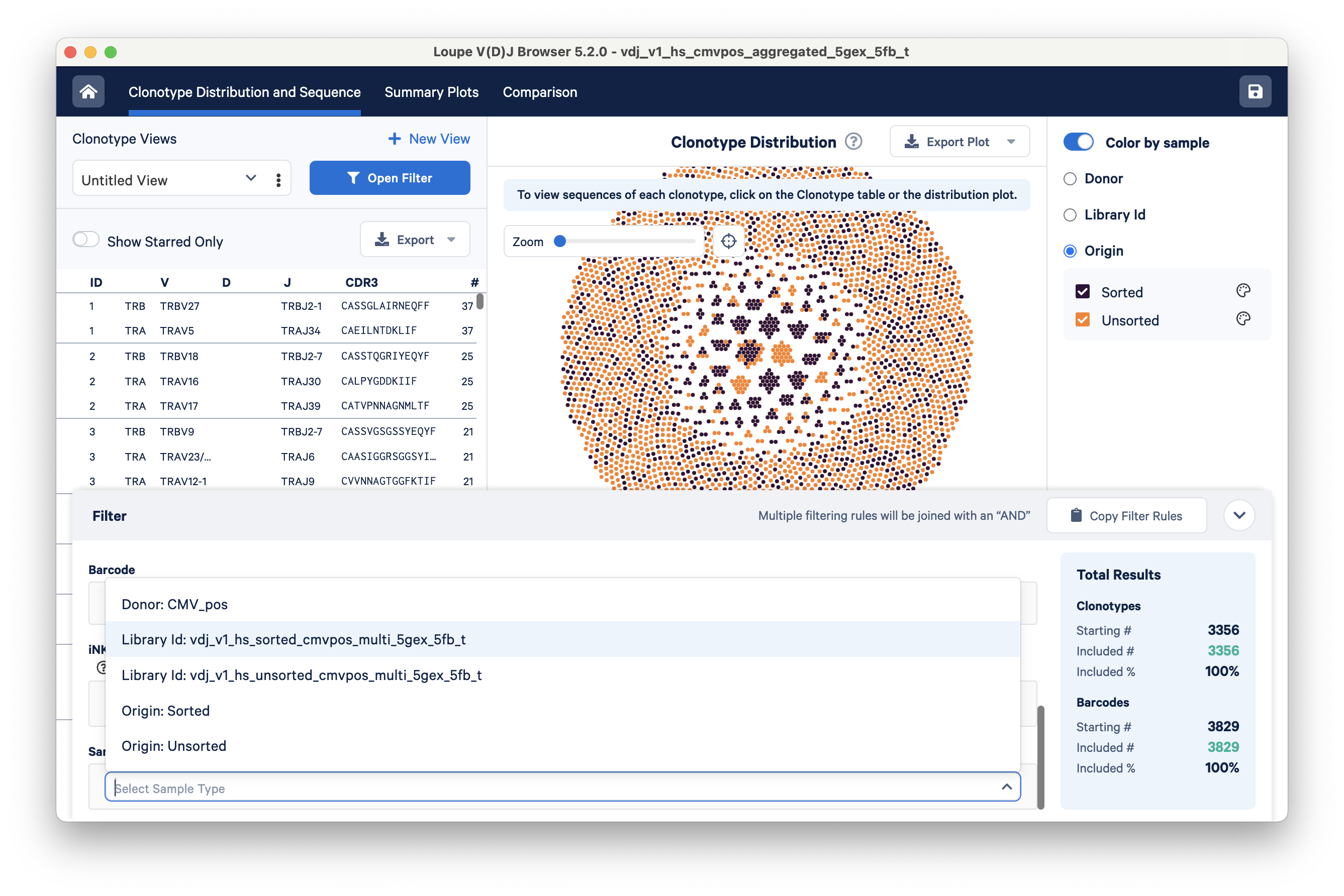
With Loupe V(D)J Browser v5.2, you can now color clonotypes in the clonotype distribution plot based on their sample of origin. Similar to the samples filter, the coloring options (right panel) are determined by the columns in the aggregation CSV. In this example, clonotypes are colored based on their origin; clonotypes from the sorted cells library are orange, and clonotypes from the unsorted cells library are black.
For more information on the definitions of the default groups, please refer to the Cell Ranger glossary.
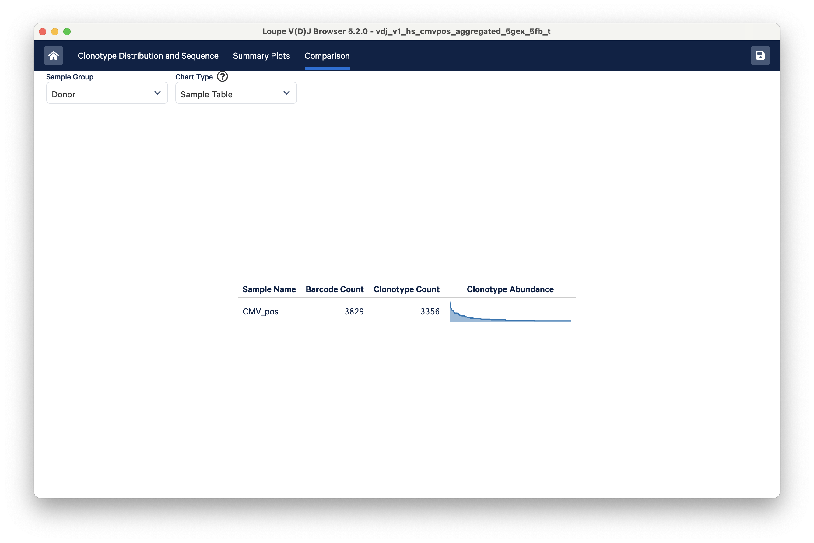
To compare the samples in detail, click on the Comparison tab.
The default view is the Sample Table per donor in the aggregated dataset. The table lists all the loaded V(D)J samples with their Barcode and Clonotype counts. There is also a sparkline of each sample's top 100 clonotype abundances. The table and other charts accessible from the drop-down menu show samples divided by sample groups (donor, origin, library ID, or custom groups).
In this example, there is only one row because the two aggregated libraries come from the same donor:
The control bar at the top of the sample table has other comparison charts. The Sample Group selector helps organize data views in various ways. In this tutorial file, the data originates from a single donor, but two different libraries were generated — one from sorted cells and another from unsorted cells. Toggle to the Library Id or Origin option.
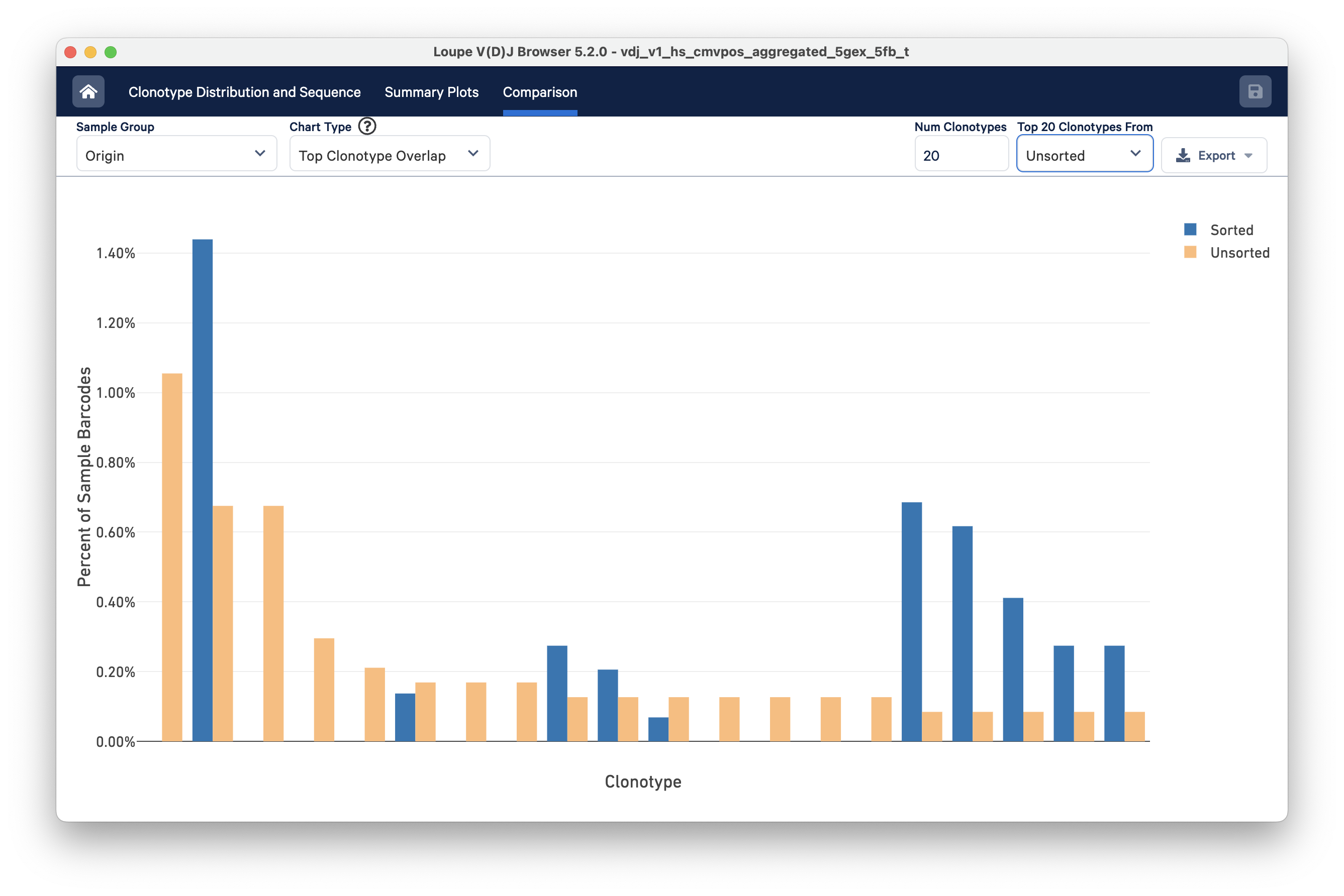
Next, use the Chart Type selector to choose Top Clonotype Overlap. This will display the top 10 clonotypes in the sorted library compared to the same clonotypes in the unsorted library. If needed, you can adjust the group of clonotypes you wish to compare by using the Top 10 Clonotypes From drop-down menu on the top right.
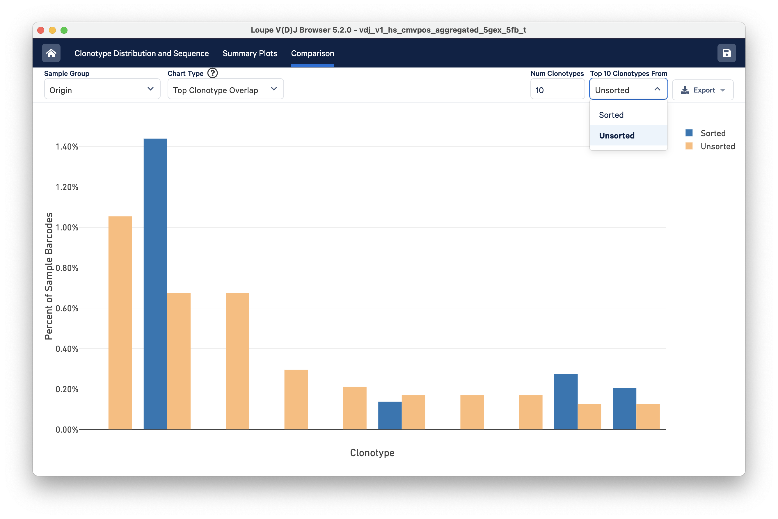
You can change the number of clonotypes being compared by editing the Num Clonotypes value in the control bar. In this example, the clonotype distributions of the sorted (blue) and unsorted (orange) cells show noticeable differences.
The Clonotype Frequency chart gives you a feel for how closely the clonotypes of two samples map onto each other. The x-axis represents the frequency of a particular clonotype in sample A, and the y-axis represents the frequency of a particular clonotype in sample B. The size of the circles at each point represents the number of clonotypes that have x barcodes in sample A and y barcodes in sample B.
To get a feel for this, compare the two samples by Origin. The mutual frequencies are shown in blue.
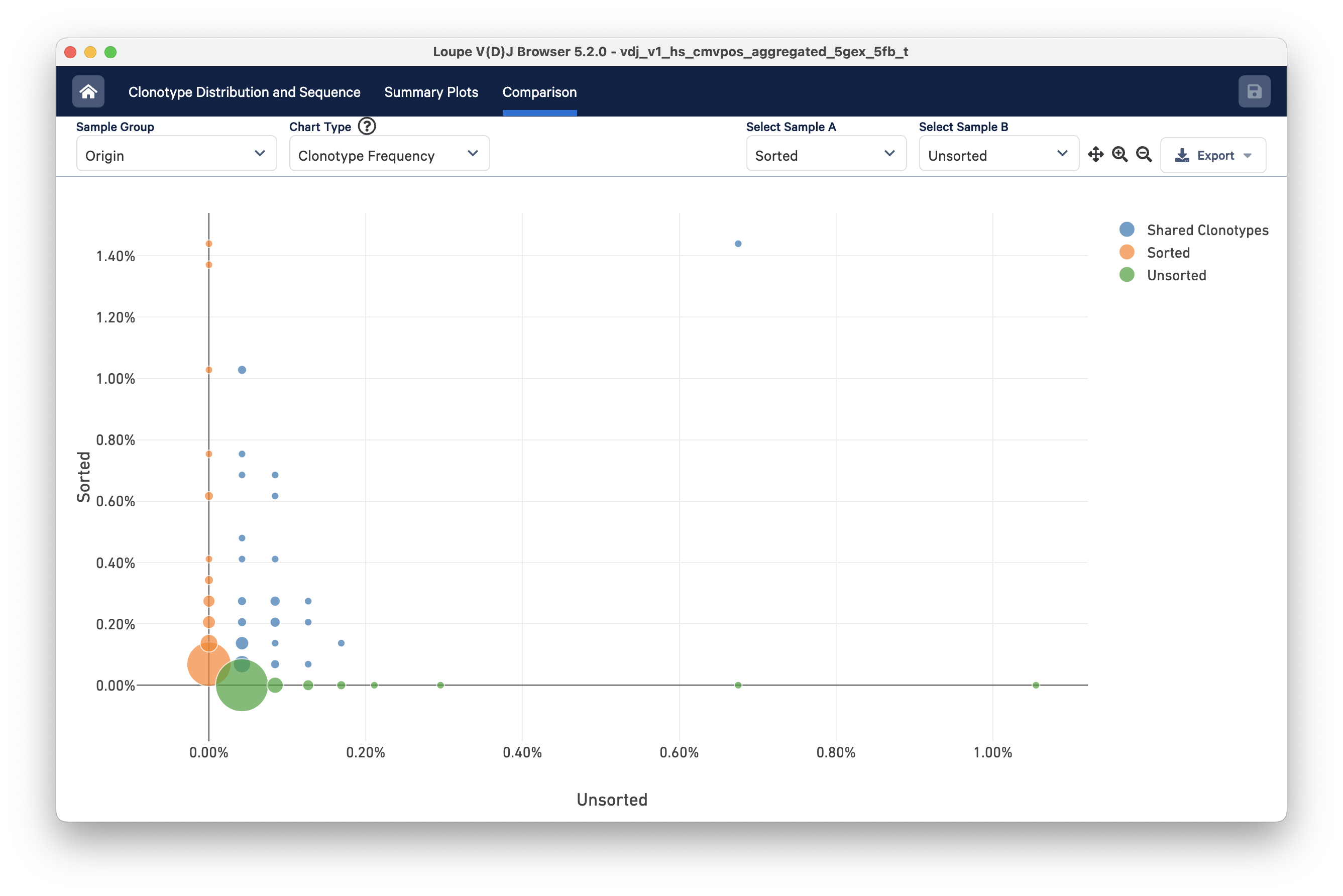
You can use the zoom in/out and autoscale buttons on the control bar to zoom into regions of the chart in more detail, and drag the chart around with your mouse.
Finally, you can compare the relative frequencies of V, D, J, and C genes across multiple samples by selecting one of those four charts in the chart type selector. For each gene usage chart, you can either look at all chain types or limit to a single chain type through the Chain Type selector.
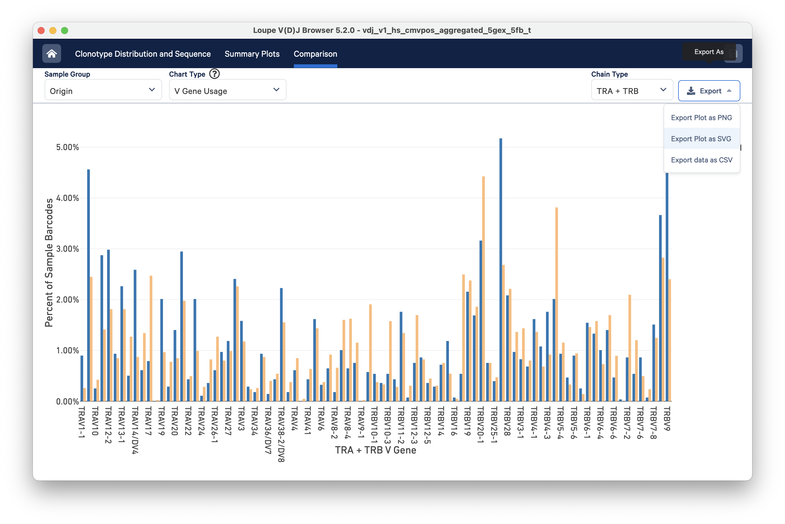
Most charts have an export button, where the chart image can be exported to SVG or PNG, or the underlying data can be exported to a CSV file (shown in the image above). When the file has a large number of samples, another selector will appear that can be used to select a subset of samples to view throughout the charts.
This concludes the Loupe V(D)J Browser tutorial. We hope that you are comfortable enough now to use this tool on your Chromium Single Cell 5′ V(D)J data. If you have matching 5′ Gene Expression data, the Loupe V(D)J Browser and Loupe Browser are more powerful together. See the integrated V(D)J and gene expression analysis tutorial.
If you encounter difficulties or have general questions about the software, email support@10xgenomics.com with your questions.