In the standard workflow, after the input information is submitted, the Xenium Panel Designer will generate a custom panel for you. The page will update as soon as the design is complete (typically ~5-15 minutes).
During the process, the design tool:
- Screens the customer-provided gene list for genes that cannot have probes designed for them (given the reference data and maximum number of probe sets).
- Creates a cell type model based on the reference data (customer-submitted or in-house).
- Assigns codewords in an optimized manner to distribute the optical utilization across the cycle-channels per cell type.
- Generates the panel design summary to assess the design. The file includes a panel summary with panel metadata and plots to assess the design. If the tool detects any potential issues, alerts or warnings are also shown.
The designer will explicitly check for the following:
- Genes whose expression is predicted to be too high to assay using Xenium technology
- Genes that we cannot design probes for
- Combinations of probes that are predicted to cause issues
- Genes that are moderately expressed in many cell types and are unlikely to be beneficial in your panel
- Genes that we have previously assayed for and pose issues (in sensitivity, specificity, etc.)
Next, review the recommendations in the panel design summary. Early in the design process, you may find the utilization plots show that the panel exceeds recommendations. Refining your panel to fit within the recommendations can be somewhat of an art, based on the cell type composition of the sample you intend to study. If individual cell types exceed the absolute threshold, it is ultimately up to the researcher to decide whether to accept the risk of significantly degraded sensitivity in those cell types due to optical crowding, or to modify the design to reduce the utilization in those cell types.
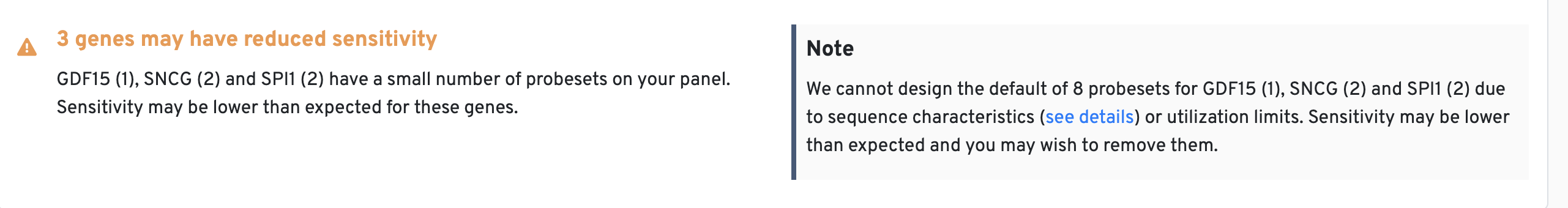
Some genes are not long enough or not unique enough to have a full complement of probe sets. While Xenium panel designs default to at least three probe sets per gene (three for Xenium Prime pre-designed, five for Xenium Prime custom, or eight for Xenium v1), we have seen detection with as few as one probe set. For more information, see the probe sets description in the glossary.
During the panel design summary review step, a probe details file (probe_info.csv.gz) is also provided. This file contains a summary of predicted off-target binding activity for each probe on your panel based on sequence similarity.
| Column | Description |
|---|---|
gene_name | Name of the gene |
gene_id | Ensembl ID for the gene |
codeword | An integer index for each codeword used to decode transcripts |
binder | The sequence of the probe in transcript orientation |
transcripts_covered | A semicolon delimited list of Ensembl IDs for transcripts covered by this probe |
offtarget_gene_names | A semicolon delimited list of gene names for the predicted off-target genes |
offtarget_gene_ids | A semicolon delimited list of Ensemble IDs for the predicted off-target genes |
In general, there are a few off-target sequence categories:
- Genes within a related family (i.e., probes targeting a gene in the zinc-finger family may also bind to other zinc-finger genes)
- Highly repetitive regions (i.e., LINEs/SINEs)
- Poor annotations or uncharacterized genes, which may also contain highly repetitive regions
We recommend examining this file for any predicted off-target sequences before finalizing the panel to decide whether the potential off-targets are problematic for your specific application. It may be ok to proceed with the design if the predicted off-target is not expressed in your study sample or is unrelated to your research question.
A panel design summary HTML file is generated to aide in the design refinement process. During the design process, the summary HTML shows results for the current design on the left and results with suggested optimizations on the right.
Click on this link to download an example HTML panel design summary showing pre- and post-optimization results.
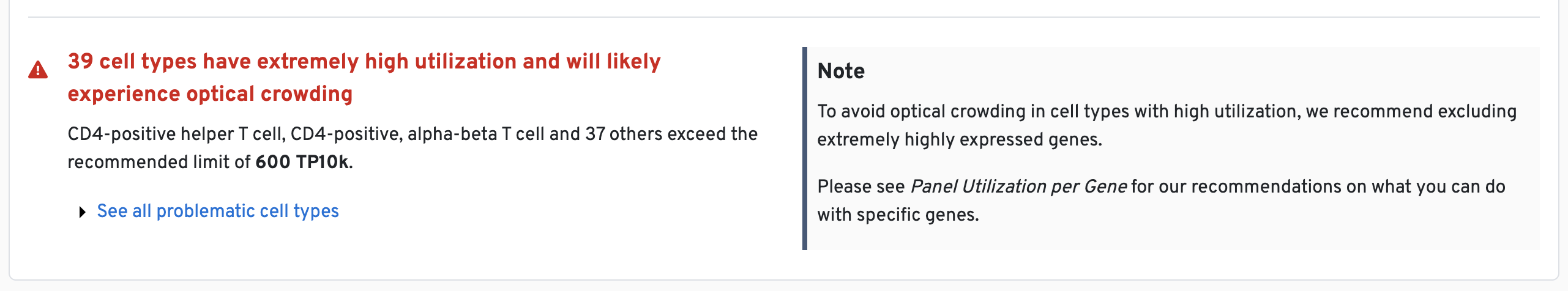
If applicable, the summary will display information about genes or cell types on your panel that exceed recommendations for specific sections of the summary. These are summarized in the Custom Genes Summary at the top of the file.
Design alerts provide indicators for potential issues in the design, which may be mitigated by following the design recommendations:
- Optimization suggested = yellow
- Optimization strongly recommended = red
For example, genes of concern (e.g., high expressors; see this Technical Note for examples) are identified in the panel design summary (both as alerts and in the plots). It is common that there will be such warnings early in the design process and it typically requires a few rounds of review to finalize a high quality panel.
One example is shown below:
A similar notice is generated when we are unable to design the requested number of probe sets per gene (shown below). This will not halt your panel design, but it does mean the sensitivity of the corresponding gene will be somewhat reduced.
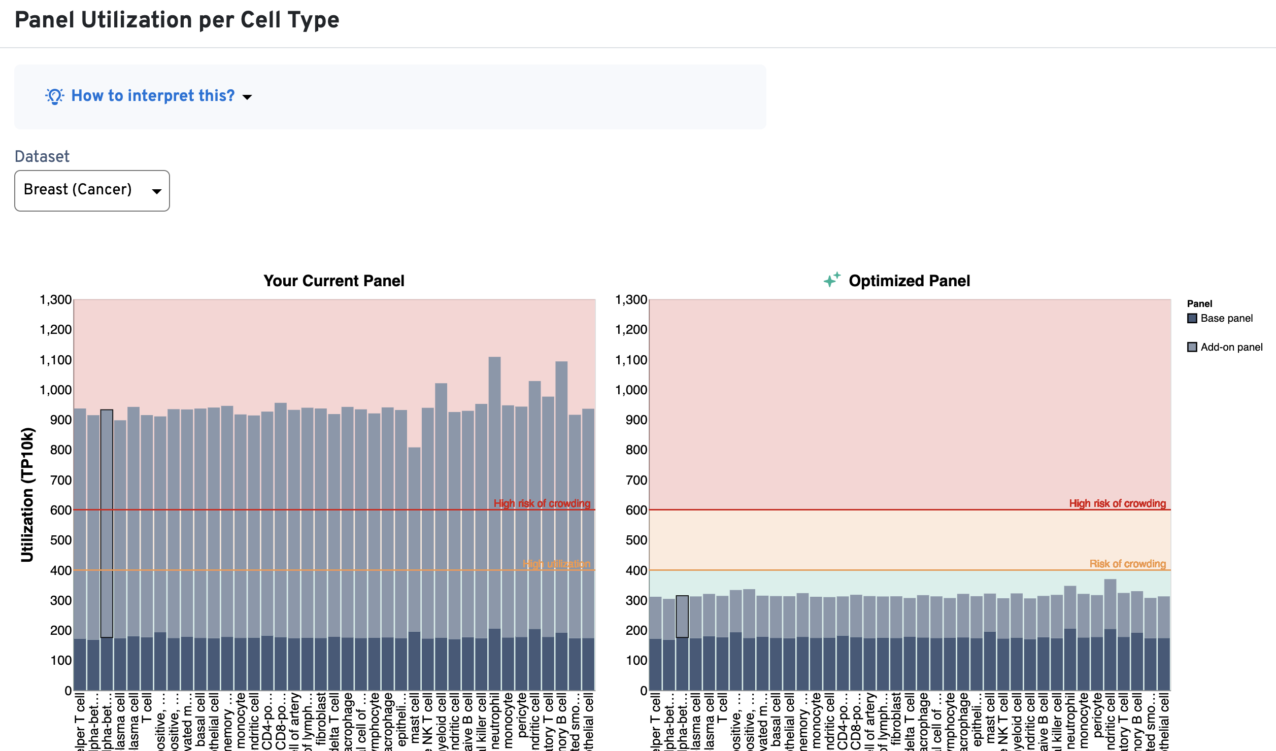
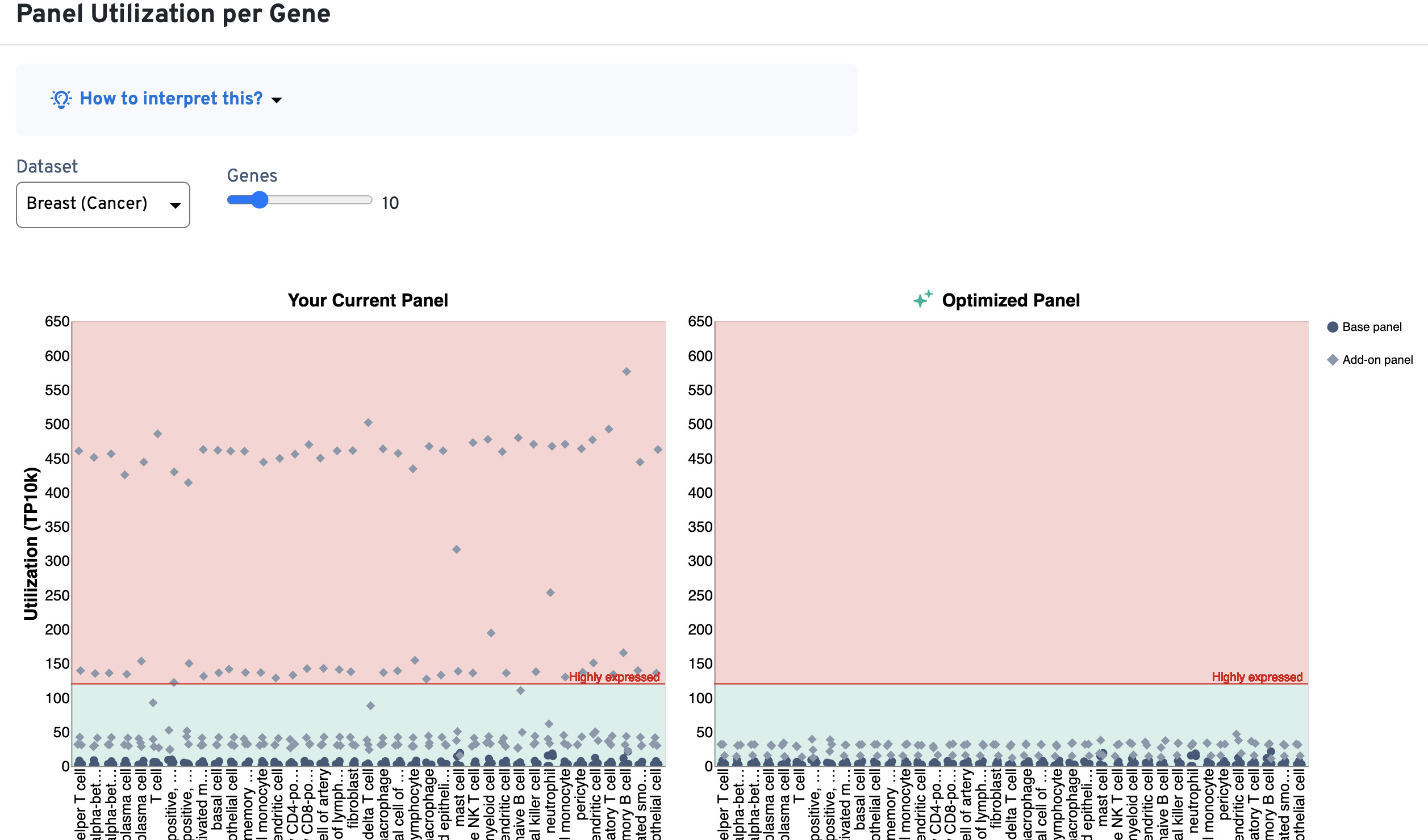
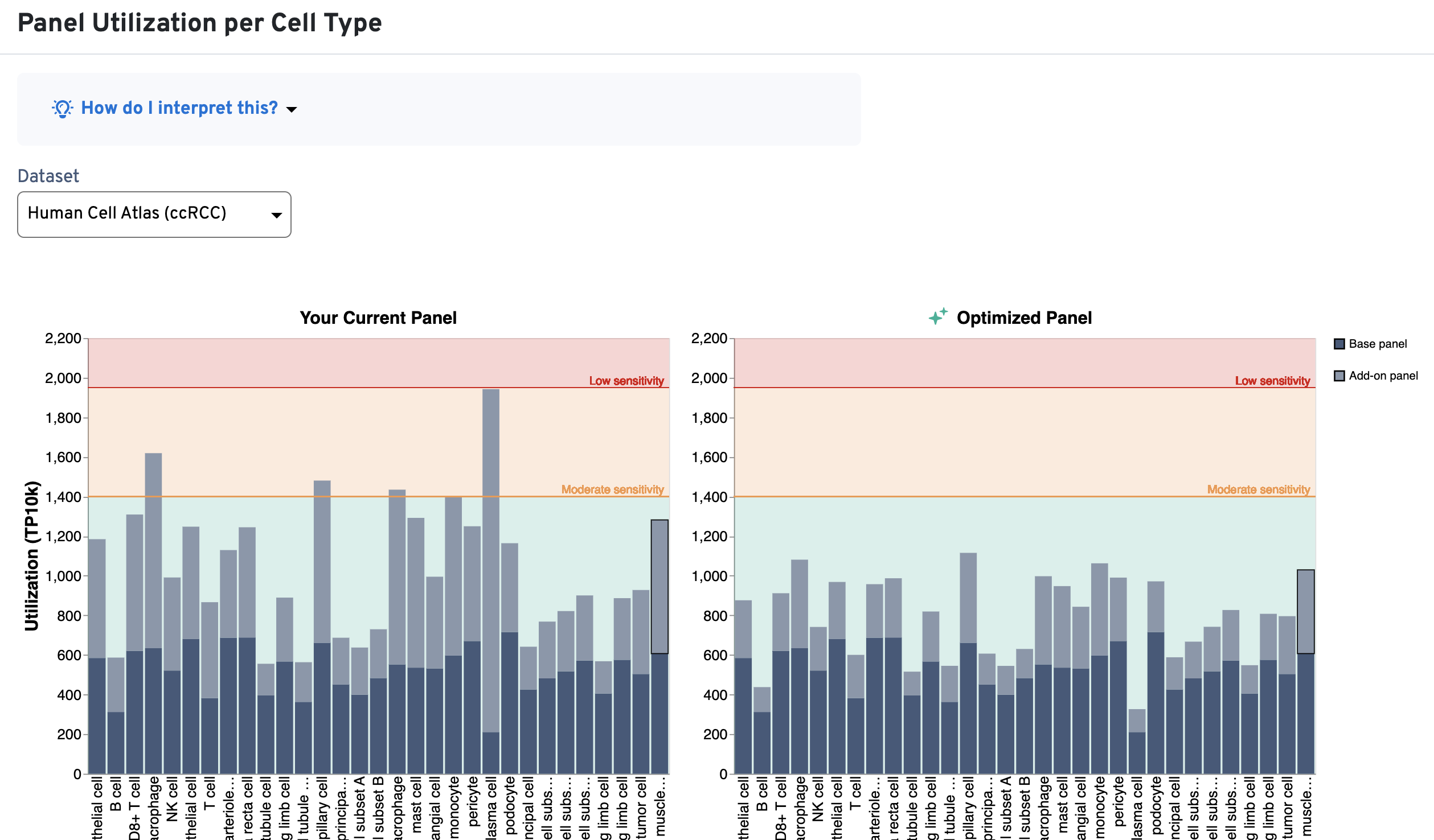
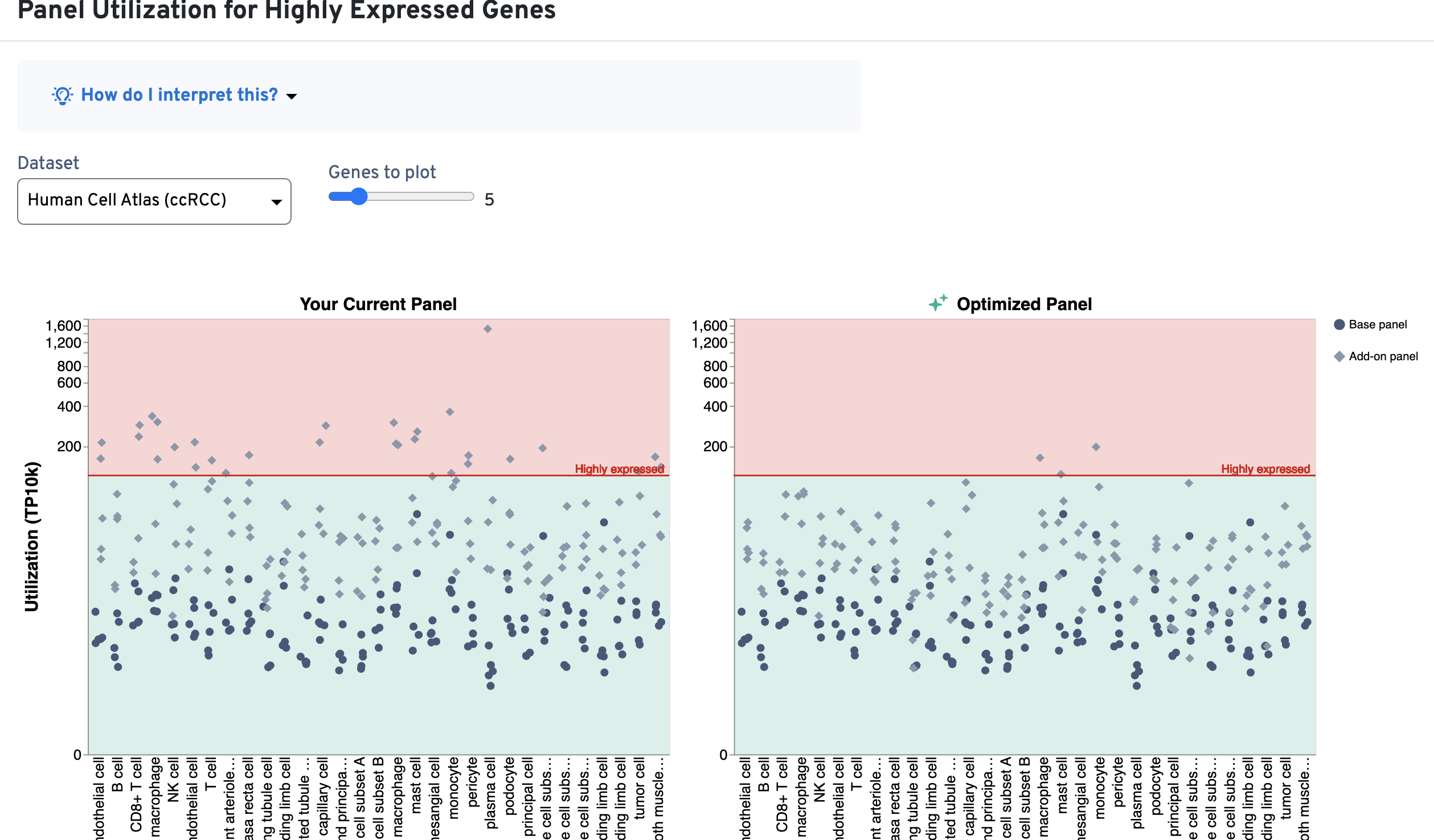
Use these plots as guides for whether genes should be removed from the design or whether the number of probe sets should be modified. The utilization thresholds are indicated by the green, yellow, and red areas of the plots. The panel designer will suggest optimizations that bring utilization per cell type and per gene within recommended ranges (green area), either by excluding genes or by reducing the number of probe sets per gene.
The Panel Utilization per Cell Type plot shows per cell type utilization (TP10K) and the Panel Utilization for Highly Expressed Genes plot shows per gene utilization (TP10K).
The panel designer considers factors based on the information entered at the Add sample info step when optimizing utilization thresholds to provide recommendations for custom panel designs. Click the View Panel Summary dropdown at the top of the summary to review the sample information you entered.
- Assay chemistry and imaging cycles: The Xenium workflow detects fluorescent probes in sequential hybridization rounds over four color channels. Each cycle and channel is imaged separately, and the total detection budget of the assay is thus the sum of the budget in each of these cycle/channels. As a result, utilization thresholds increase with more cycles (higher for Xenium Prime experiments with 36 imaging cycles, lower for Xenium v1 experiments with 15 imaging cycles).
- Tissue preparation method: We observe differences in RNA content and availability between fresh frozen and FFPE tissues. As a result, utilization thresholds decrease with section thickness or state (fresh compared to fixed).
An example is shown below for a Xenium v1 custom panel design, where several cell types exceed the 400 TP10K recommendation (above yellow area; left-side plots) and multiple genes also fall into the red area of the plot (above 120 TP10K). As design iteration occurs, you may choose to reduce the number of probe sets for the highly expressed genes (or remove them) in order to bring these metrics into the recommended ranges (now in green area; right-side plots):
Here is an example for a Xenium Prime custom design. As described above, the threshold limits are higher since there are more imaging cycles for this assay chemistry. The left-side plots show several cell types and genes exceed the recommended ranges. The right-side plots show the optimized results that bring the utilization metrics back into the green area.
This section provides guidance on genes in the current panel that you may wish to reconsider including in the final design. These include highly expressed genes and genes that have caused degraded assay performance in internal panel testings by 10x Genomics.
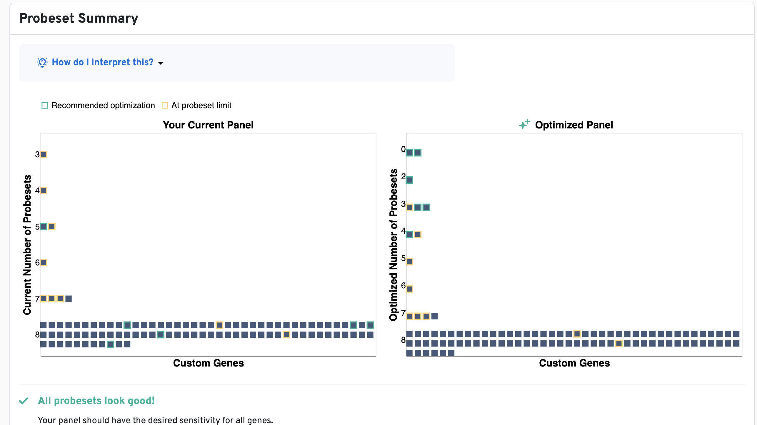
The Probe set Summary plot provides a quick visual check for the number of probe sets and panel sensitivity for each gene in the panel. The plot helps to confirm the number of probe sets used for designs before any reductions in the design process.
- Green outlines on genes (squares) indicate that we recommend reducing the number of probe sets in order to combat crowding.
- Yellow outlines indicate that the gene is using as many probe sets as we can design for that gene.
You can hover over the square to view the current and recommended number. Within each group, genes are sorted alphabetically. The alerts below the plot highlight genes and their current probe set number in parentheses that may be problematic in the design.
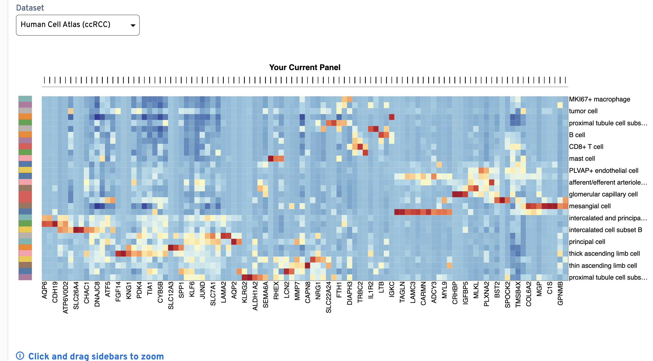
The Expression Heatmap plot provides a quick visual check that barcodes correspond to the expected gene expression cluster patterns by cell type. Click and drag the bars above and to the left of the plot to zoom in to genes (x-axis) and cell types (y-axis). The colors on the y-axis bar help visually distinguish neighboring cell type rows, but are not meant to map to each unique cell type.
Z-scores are calculated across all cell types for a given gene. This plot is useful for checking that the clustering pattern for each cell type is distinct between types (row by row). If genes on your final panel are missing in the reference data, their expression levels are imputed (expressed at the 90th percentile of genes within each cell type they are missing from).