The Antibody Barcode Rank Plot ("AB Barcode Rank Plot") is an interactive plot that shows all barcodes detected in an experiment, ranked from highest to lowest Antibody UMI count.
Where can I find the AB Barcode Rank Plot? This depends on the Cell Ranger pipeline and experimental setup.
In the cellranger count web summary:
- This plot is shown for Antibody-only analysis. It is it not generated if a Gene Expression library was present in the Cell Ranger analysis.
In the cellranger multi web summary:
- For GEX + Antibody Capture analyses, it will always be generated.
- For single-sample experiments: this plot will only be shown in the Library view's Antibody tab.
- For 3' Cell Multiplexing experiments: this plot will be shown in the Library view's Antibody tab (i.e., if multiple antibody-stained samples are labeled with CMO tags and pooled in one GEM well, resulting in three libraries - Gene Expression, Multiplexing Capture, Antibody Capture).
- For multiplex Flex experiments: this plot will be shown in both the Cells view and the Library view Antibody tabs (i.e., if multiple antibody-stained Flex samples are pooled in one GEM well). In this scenario, the barcode rank plots for each sample (on Cells view) are most helpful for sample-specific quality assessment and troubleshooting.
Like the Gene Expression barcode rank plot, the y-axis shows UMI counts on a logarithmic scale and the x-axis shows barcodes sorted in decreasing order from the number of UMIs on a logarithmic scale. Note that the order of barcodes in the Antibody barcode rank plot is not the same as the order in the corresponding Gene Expression barcode rank plot.
The blue regions of the curve represent cells called using the Gene Expression data (if present), not the Antibody Capture library. The Antibody Capture library is used for cell calling only in Antibody-only analysis (no paired gene expression library). The gray regions represent background.
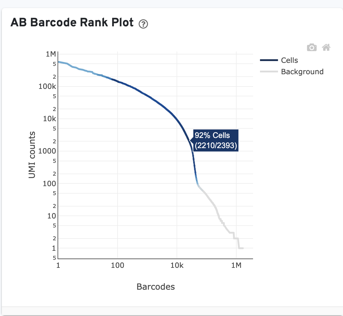
Click on the ? for a high-level summary of the AB Barcode Rank Plot.
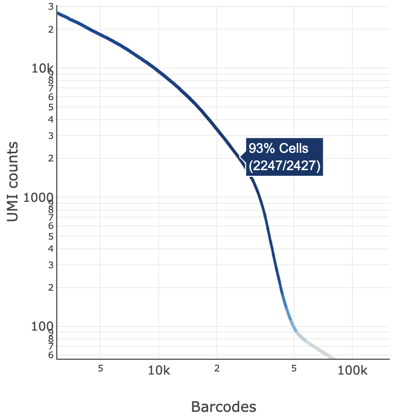
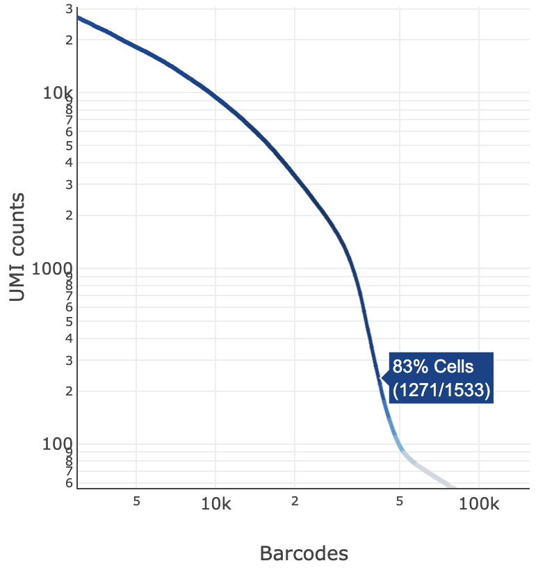
You can zoom in and out along the X and Y axes and hover your mouse over specific data points. Percentage values appear as you hover over different regions of the plot. These numbers show the proportion of barcodes that were assigned as cells by the Gene Expression data cell calling algorithm for a given UMI range.
The blue color gradient is proportional to the fraction of cells in a given subset of barcodes; darker blue indicates a higher proportion of cell barcodes versus background. An example is shown below for interpreting two different percentage values that pop-up while hovering over data points.
 |  |
|---|---|
| 2247 of 2427 (93%) barcodes in this UMI range were called as cells | 1271 of 1533 (83%) barcodes in this UMI range were called as cells |
Barcodes associated with antibody aggregates are detected and removed from cell calling. Often, these barcodes have unusually high antibody UMI counts and appear at the top left of the AB Barcode Rank Plot. This region will consequently be gray if the algorithm regards it as background.
For example, in these example plots, the fraction of antibody reads in aggregate barcodes is 1.58% (left) and 20.81% (right):
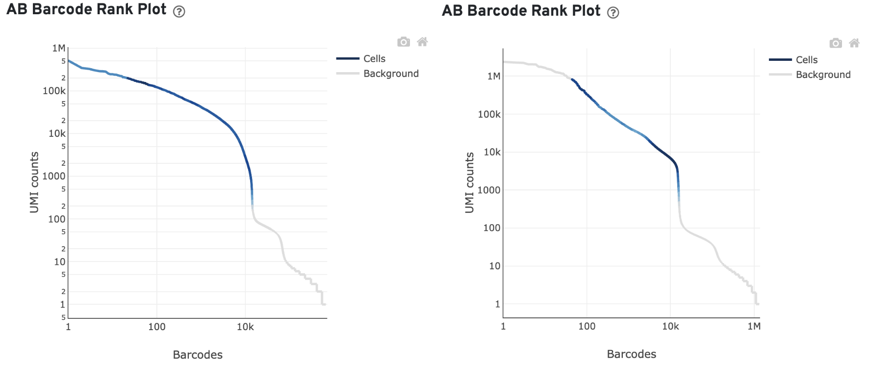
The "Fraction antibody reads in aggregate barcodes" metric is listed in the Mapping Metrics table of the multi web summary.
The barcodes removed by aggregate filtering can be found in the aggregate_barcodes.csv file described here.
Antibody data quality can vary depending on the antibody panel and the sample complexity.
The AB Barcode Rank Plot may have a "cliff-and-knee" shape, similar to the typical shape of Gene Expression Barcode Rank Plots.
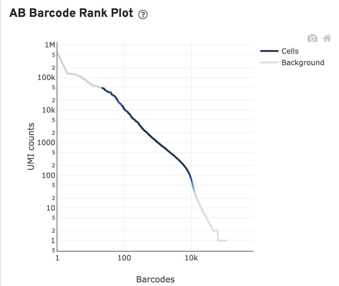
However, an AB Barcode Rank Plot that does not have an obvious "cliff-and-knee" shape does not always indicate poor antibody data quality. For example, this sample has a reasonably high percentage of antibody reads in cells (68.23%), despite the linear barcode rank plot shape and high percentage of antibody reads in aggregate barcodes (21.49%):
Here is an example of a poor AB Barcode Rank Plot. For this library, only 27.93% of antibody reads are in cells (few cells called in the top left high UMI region) and 19.15% of antibody reads are in aggregate barcodes.
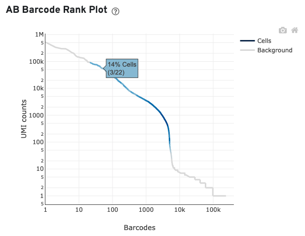
For this example, many barcodes with high antibody UMI counts (>2000) are not called as cells in the corresponding gene expression data, suggesting high ambient antibody signal. In general, when the fraction of antibody reads in cells and/or usable antibody reads are low and there is an indicator of high ambient antibody signal, the sample may have one or more of the issues below:
- Insufficient washing of the cells
- High amount of cell debris in the sample
- High number of antibody aggregates in the sample